[Platform One]
- Branding
- Logo Design
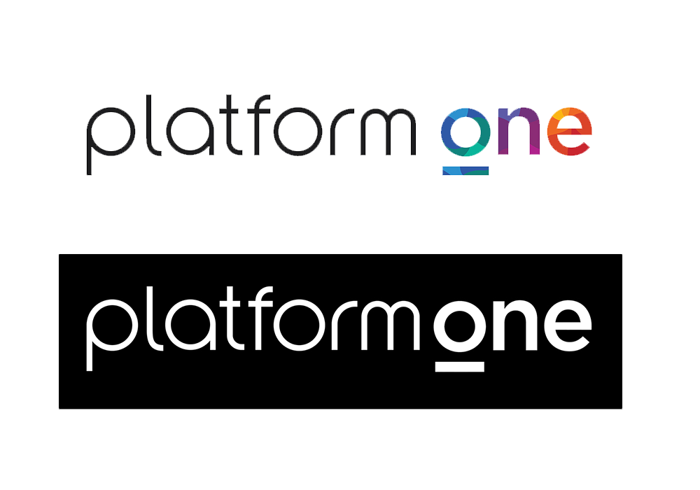
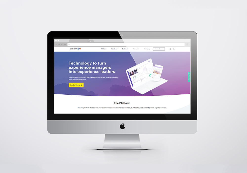
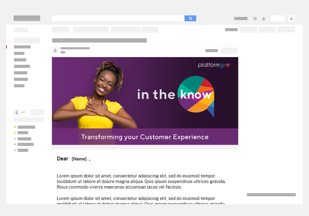
The company decided to go through a rebrand of its original name 'Potentiate' into 'Platform One' to represent a change in direction of the business. As such a new logo was required which I as the company's digital designer and my associate graphic designer was tasked to come up with. The final logo design chosen for the brand was a design that used simple thin dark lettering for 'platform' while making 'one' contain the brand colours. The 'O' in 'one' had a line below it to represent the idea of a platform, which was also used to create an alternate symbol version that used all the brand colours in one design. The decision was made to change the presentation of the colours from geometric shapes into soft and curved shapes in order to mesh the colours more harmonious and represent something less rigid and more rounded. The designs also include black and white versions and the applications on various material.